SOL
Branding & Visual Identity
We designed a food tour app that builds a personalized route based on your location. Our focus was on creating a fun, intuitive, and visually rich experience that makes exploring local food spots feel exciting and effortless. With a clean interface, playful color palette, and smooth navigation, the design invites users to taste their way through the city with ease.
Designing a Flavorful Journey

A Taste of Freedom
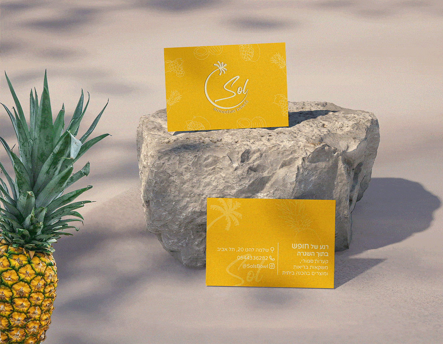
Sol is a boutique smoothie bowl shop inspired by the sea and nature.
We created a brand identity that reflects its free-spirited, boho-chic vibe — a sense of flow, harmony, and relaxation.
The visual language combines bold, fruit-inspired colors with delicate hand-drawn lines, resulting in a vibrant and inviting brand full of life and flavor.

Sol is for everyone
It's for those who love freedom, social moments, nature, and a fun, uplifting vibe.
In designing the brand, we wanted to capture that open and joyful spirit, creating a look that feels fresh, natural, and full of life.
It embraces fruit lovers, smoothie enthusiasts, and anyone who enjoys a healthy, colorful lifestyle.


Taste feeds the soul
Quality, Atmosphere & Taste
We designed Sol to reflect its core values — fresh, natural, and high-quality with good vibes.
The visual identity and space were carefully crafted to feel open and inviting, creating a relaxed and effortless atmosphere. Overall, the brand conveys energy, color, and a sense of thoughtful, vibrant design.


The connected script font represents a seamless, natural experience. The semi-circle around the text symbolizes completeness and ongoing connection. The palm tree, with its trunk forming part of the semi-circle, adds a touch of tranquility and ease. Each element is designed to evoke a sense of ease and connection with nature, aligning with our brand’s core values.
The logo embodies a sense of flow, harmony, and relaxation in a tropical vibe.


Sterile Area
Maintain a clear circle surrounding the logo
Color
Use color #fffbce on colorful backgrounds
Tagline Placement
Should be positioned close to the bottom of the logo and encircle it.


Bold fruit colors infuse the brand with vitality and appetizing appeal. Expanding our graphic language, I’ve illustrated various fruits with delicate, fine lines, bringing a fresh and inviting aesthetic to life. This graphic language is designed to always have the ability to grow,allowing the addition of new colors and fruits that align with the brand’s aesthetic at any stage.
Color palette &
Graphic language


